There are several new interesting features in the most current version of Open Nettest public portal. One of those is the new broadband map.
We spent considerable amount of time to understand how users use broadband map and how to improve that experience. Based on this understanding, we set several design goals that the new solution should tackle:
- Immersive broadband map
- Visualisation of the regions
- Simpler filters
- User privacy and GDPR compliance of the broadband map
- Timeline to visualise trends
- Optimised mobile layout
However, these improvements could not be made without some compromises. To improve the user experience, we needed to reduce the amount of features and simplify the ones that remained.
Norwegian Telecommunications regulatory authority NKOM is the first customer who deployed the newly created broadband map. The map is available on the Nettfart portal. Nettfart is NKOM’s most popular digital offering with almost 100.000 visitors per month.
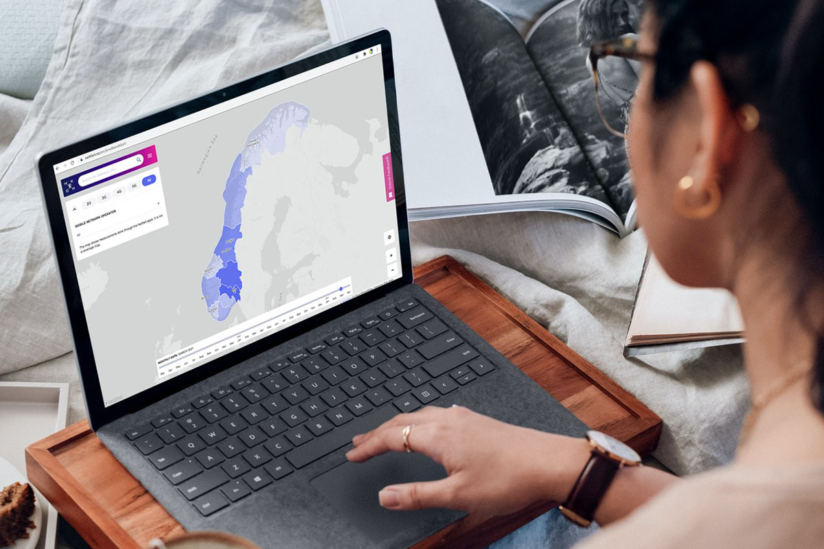
Immersive broadband map
When it comes to the map, we were not happy with the default layout of the portal. The default layout includes the header and footer at the top and the bottom of the page respectively. On wide screens the remaining area was just too short; on mobiles there was hardly a place left to display the base map. When designing the optimal solution, we inspired ourselves with the industry leading map providers and their products. We decided to go for an immersive experience, without scrolling and reduced elements such as menus and buttons. This decision also had some consequences. The menu and the layout of the map page had to be different to the rest of the portal. Nevertheless, we are persuaded that the benefits of this solution outweighs the potential disbenefits and that the users will appreciate the improved experience.
Visualisation of the regions
The new map provides intuitive visualisation of the measurement results per region. When the user visits the map page for the first time, the default zoom level is used. In this zoom level, the whole of Norway is visible with its 11 counties. To get to the municipality level, the user has to zoom in on the map and the map will adjust the level of detail accordingly. There are 356 municipalities on the broadband map of Norway.
As the user further zooms in, the visualisation further adjusts to display more and more details. At the levels below municipalities, a hexagonal grid is displayed. The hexagon change further dynamically in size as the user zooms in further. The smallest hexagons available on the map are roughly 10,000sqm in size. At any zoom level, the user can click on the respective region, be it county, municipality or a hexagon, and a popup with more detailed information about the number of measurement, average download speed, upload speed and the average latency will appear.

Simpler filters
We also decided to reduce the amount of choices the user has to make on the map page. This might sound counterintuitive at first. Why would a reduced set of features benefit the user? We found out that many of the features on the legacy map were not used and the users considered the user interface cumbersome. Also, there just too many use cases the map was trying to solve; and ultimately the legacy map did not provide an excellent solution to any of them. By reducing the amount the filters on the map, we reduce the amount of choices the user has to make to get a meaningful visualisation of the crowdsourced results. This reduction allowed us to make a more streamlined, easier-to-use user interface and even add additional useful features that were previously not available.
User privacy and GDPR compliance of the broadband map
The legacy map displayed very precisely the location of the individual measurement with a color coding of each measurement point from red – bad to green – good. However, there were several issues with this approach. Occasionally users would complain that their location is visible on the map. Additionally, the time of location and the type of headset would be visible too.
Event though Open Nettest does not process sensitive personal data such as name, contact details and similar, we process the geo-location attributes that still fall into the category of personal data. To avoid unnecessary disclosure of these data, we decided to indicate only approximate location and aggregate several data points into hexagon-shaped areas. The smallest hexagonal area is about 10.000sqm large. This is generally considered sufficiently large so that it is not possible to identify the person behind the measurement.

Timeline to visualise broadband trends
We collect many data each day, week and month, so we decided to add a trends visualisation in time. The new timeline slider allows users to chose a month for which the data should be displayed. The user can move the slider to the left or right and the map will instantly update according to the settings. For this feature to work smoothly, the server pre-calculated the data for each month. As a side effect, this concept also leads to improved performance and reduced data traffic.

Broadband map optimised for mobile layout
In line with the general trends, a substantial number of the portal user are mobile users. We wanted to prove the best possible experience for them, so we redesigned the responsive layout especially for use on smaller screens and touch screen usage. As a result, the user interface is less cluttered and fun to use on a mobile device.

Summary
The new, interactive maps is one of the new features in the most current version of Open Nettest public portal. It provides simple, yet attractive, user experience. The privacy of the users who contribute with the crowdsources measurements has been greatly improved. A new time line feature makes it possible to view trends in time. If you are keen to experience the new map live, please visit the Nettfart public portal and let us know what you think.